The Fourth Quarter
2022
Wigan Wildlife Gardener
2022

Ode To Livestreaming
2022
The Third Quarter
2022

The Second Quarter
2022

The First Quarter
2022
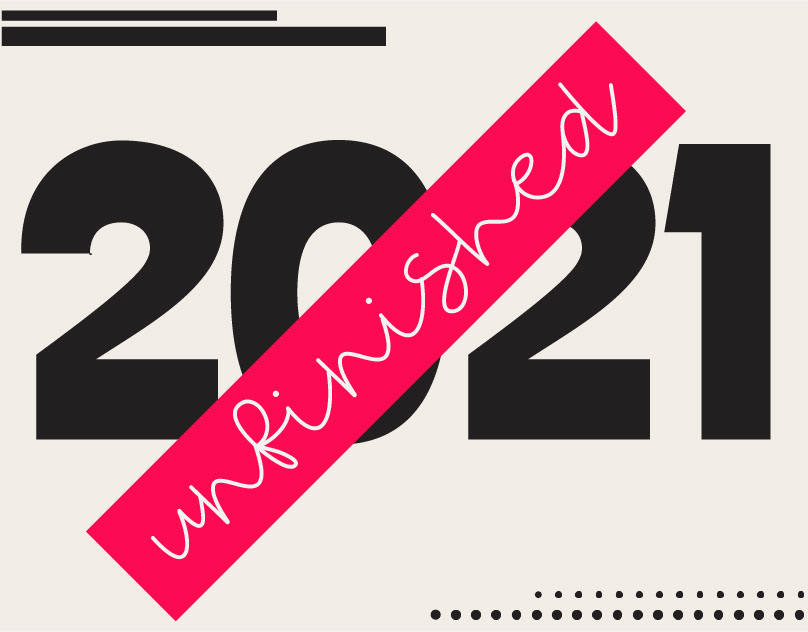
Unfinished 2021
2021

Circleism
2021

Create Waves
2021
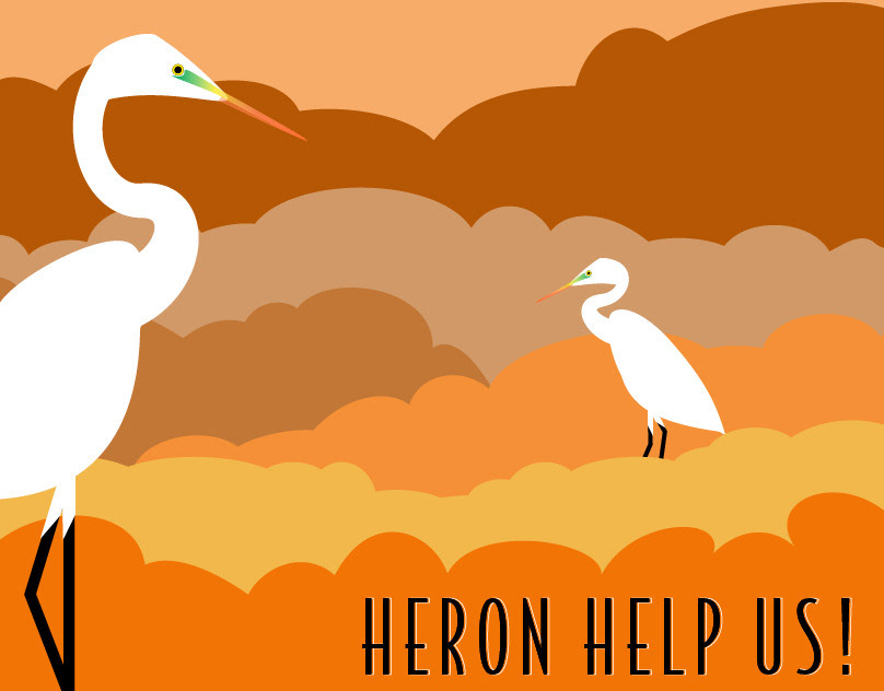
Heron Help Us!
2021
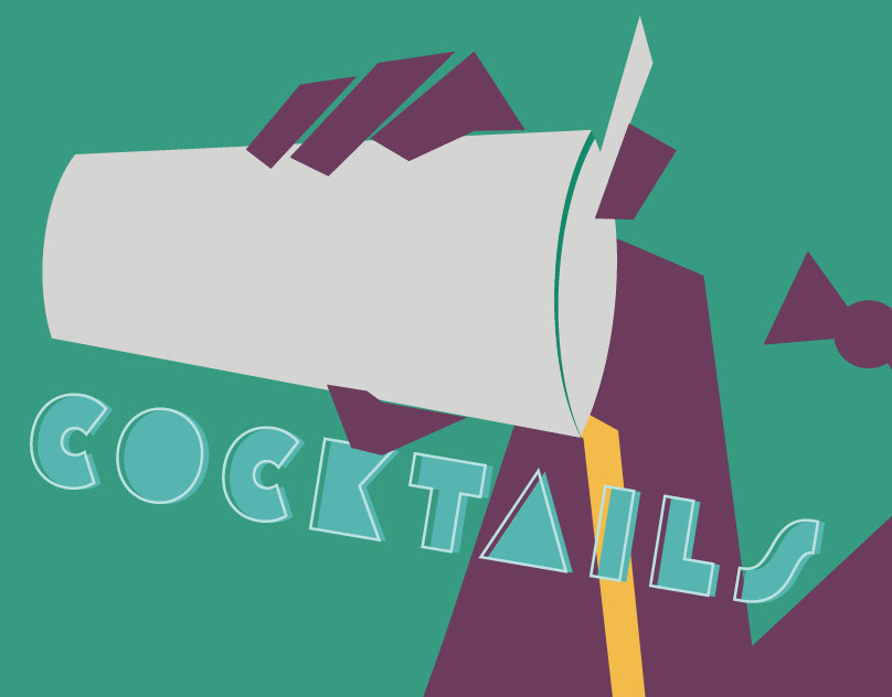
Cocktails, Anyone?
2021
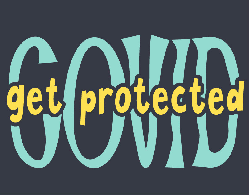
Get Protected
2021
Sybil and Jane - My 100-Day Project 2020
2020
Animation Using Photoshop
2020

Hello, it's me!
2020
Daily Creative Challenge for Photoshop
2020