this was my first project on Behance
Challenge #1
Use Skew on text
The emphasis being on subtle changes that change the text appearance. For the background version of the text, which is simply enlarged, I added both a gradient of three colours and a little texture.
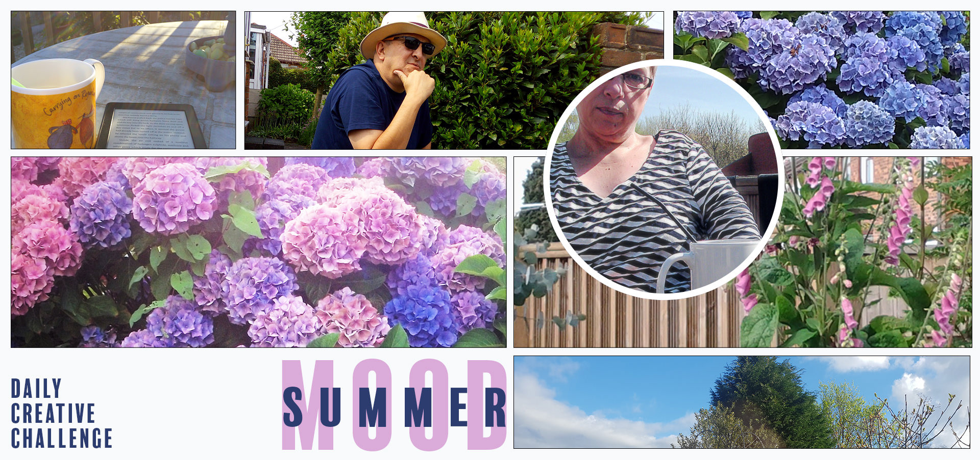
Challenge #2
Create a mood board for Summer
Sitting here on a windy, wet day in June, my mood board challenge became a reminder of Summer days here at home. A mug of tea is always close by...
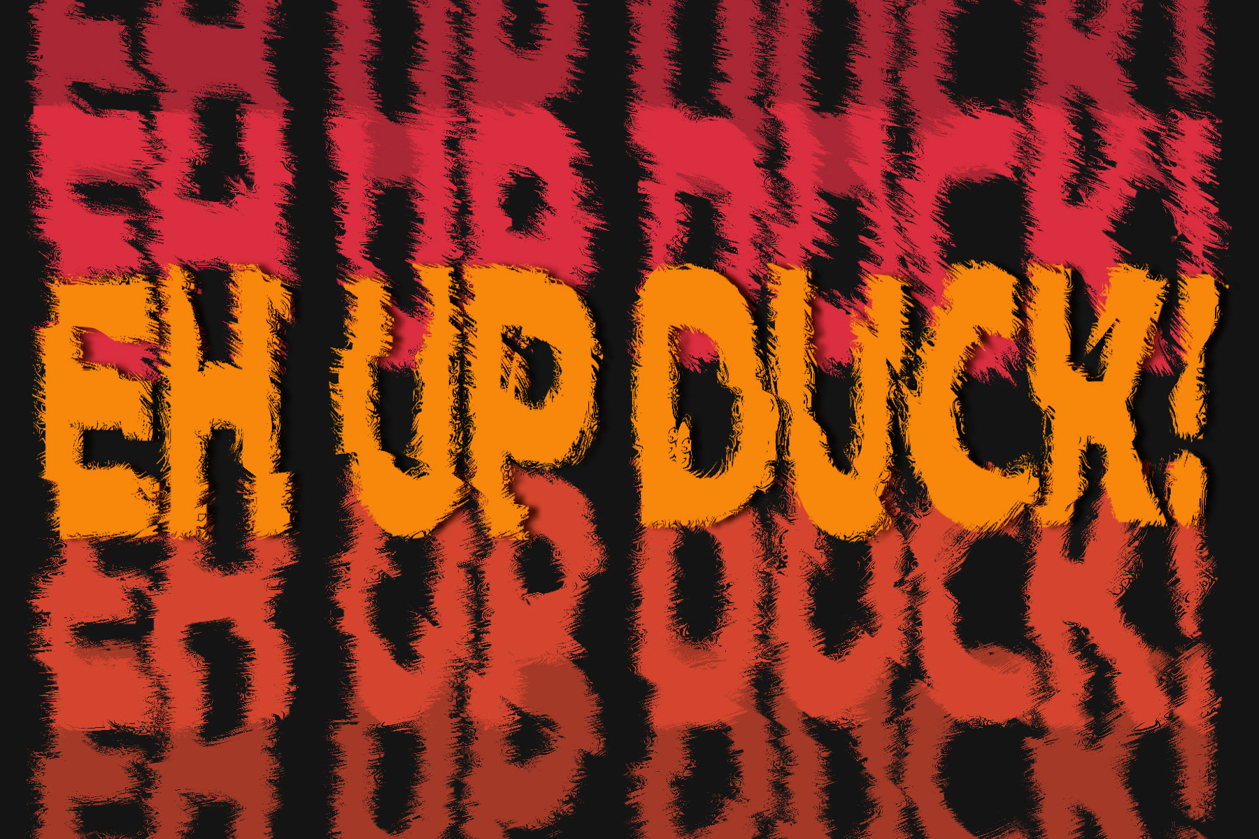
Challenge #3
Design a monogram for a postcard
The letters are converted to shapes; this meant I could edit the path of the "b" to remove the serif at the top, and keep it aligned with the j. Duplicating the b and masking it meant I could restrict the Blend Mode (Saturation) so that it affected only the overlapping area with the j.

"Eh up duck!" is a friendly greeting I've grown up with. I decided to play a little more, and added a Gradient Map to the text, using the red and yellow. The background has a distressed texture, at a low opacity; I love texture. And then one final bit of experimentation; the monogram has a Drop Shadow in white, with full opacity, and I scrolled through the Contour options to get a faux, chalked outline.
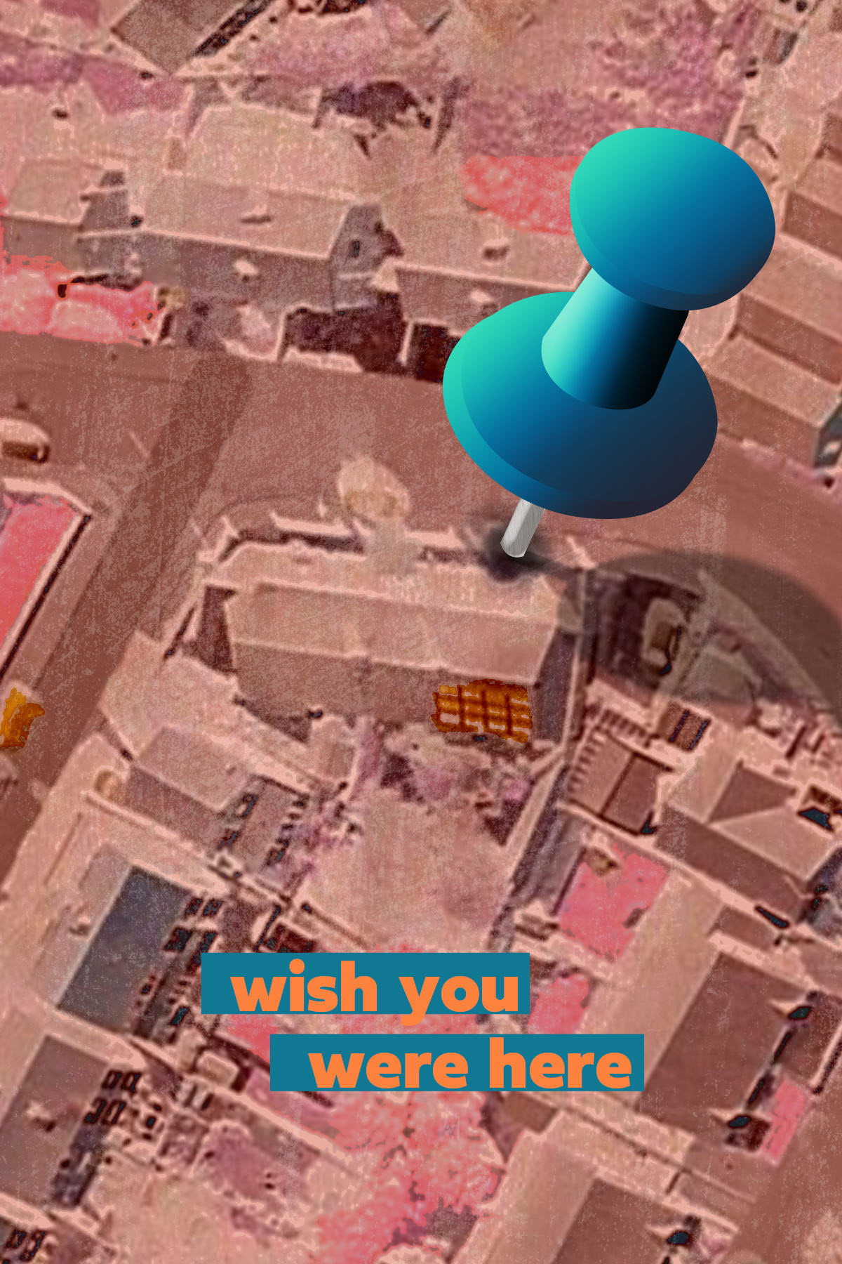
Challenge #4
Create a technicolour postcard
My result isn't particularly lurid, but I liked the combination of pink tones with the blue push pin. I drew the pin with the Shape Tool and added gradients, some texture and the shadow of the hole.
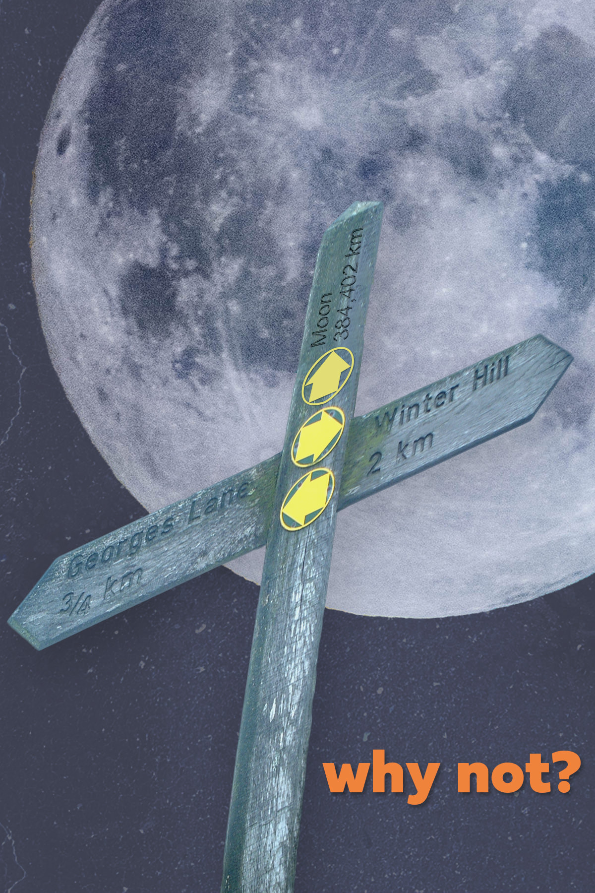
Challenge #5
Make a collage
The signpost is from Winter Hill, and when masking I had the idea to add a third yellow arrow and have it pointing to the moon. Why not, eh? The moon photograph is from chuttersnap-pE8WW245aik at Unsplash.
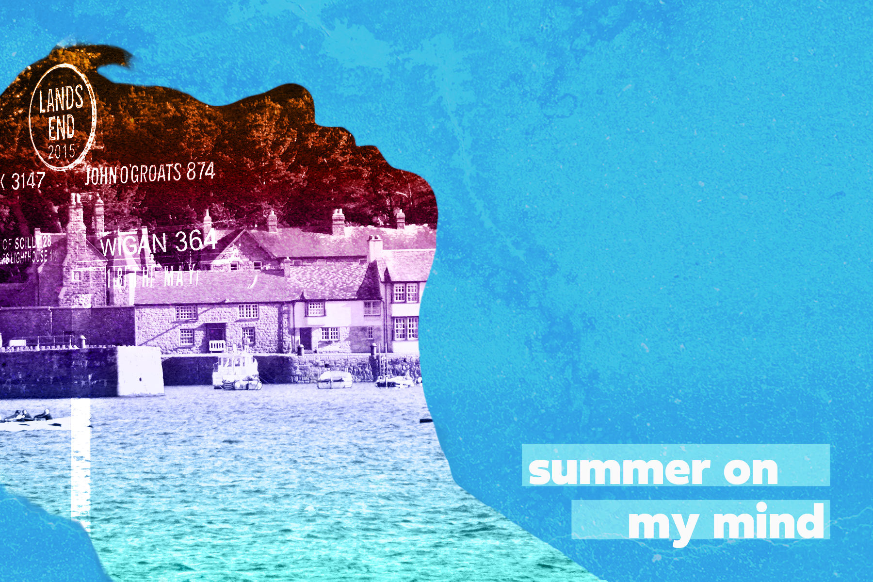
Challenge #6
Double Exposure
I used a self-portrait for the silhouette. The village is in Cornwall, and I masked the signpost from Land's End to blend in too.
Challenge #7
Make some marbling
Using Liquify to emulate marbling. The original photos is of red geraniums in terracotta pots against a white wall with a small blue brick area.

Challenge #8
Displacement Maps
The first map is from a paper texture I made years ago, and gave the text all the fuzzy edges. For the slight, overall wave of all the text, I quickly drew my own map, very detailed and professional, ahem.... To fill the postcard I repeated the text with various shades of orange to red and tested Blend Modes to find a look I liked.
Here are my Displacement Maps...
Challenge #9
Use an Action
And who wouldn't when they're as good as this! The Action, not the subject...
This fantastic Action is called Toon Artist by Nuwan Panditha and I had great fun playing with the colours once the action was finished. I am so impressed with the detail, all the layers, all the options - I've never seen an action quite this detailed.
You know, I think it even manages to make me look artistic!

This Daily Creative Challenge took place 9-19 June 2020.