Introduction
In October 2019 my husband gave me an early birthday present: a full subscription to Creative Cloud. I love learning, and wanted to try out all the programs!
Illustrator was top of my list, and I eagerly opened it up - for about five minutes.
Looking back (it's now April 2021) I don't know why I was so intimidated by Illustrator. Instead I tried Premiere Pro and dived in feet first, learning the program as I edited my first Skillshare class.
And then the world changed. Covid became part of our vocabulary and here in England, at the end of March, we were in lockdown.
Note: as Alt Text is character-limited, I am providing terrible image descriptions within the presentation.
The 100-Day Challenge
The premise is simple: choose a project, or activity, that you want to improve and do it, every day, for 100 days.
I recently discovered the art of Sybil Andrews, and was captivated by her use of simple shapes, limited colour palettes and texture.
My challenge is to learn Illustrator by recreating the works of Sybil.
Motorcycles
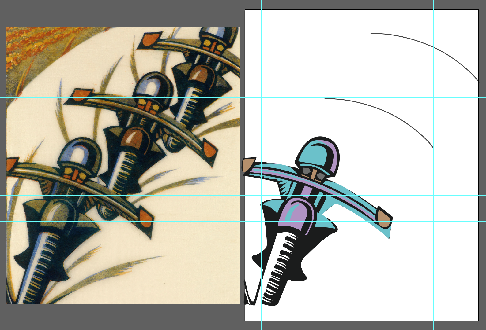
Yes, I tackled a difficult piece to start my challenge! But I really love the action in this depiction of speedway motorbike riders. Drawing a grid to help with positioning certain points helped a lot with getting the perspective to look right.
Image descriptions
On the left: Speedway by Sybil Andrews, three motorbikes racing around a corner. The riders diminish in size from left to right, in a gentle curve, with dirt rising form their wheels. The original colours are muted khaki green, blue highlights on the helmets and black for their legs.
On the right: my first progress image, where I've drawn in the front wheel, handles and legs of the first rider. I've chosen a colour scheme of muted turquoise and purple, with black.
More progress shots below, as I complete the first rider, and copy it twice more to complete the image. At least that part is easy, once the first motorbike is drawn!

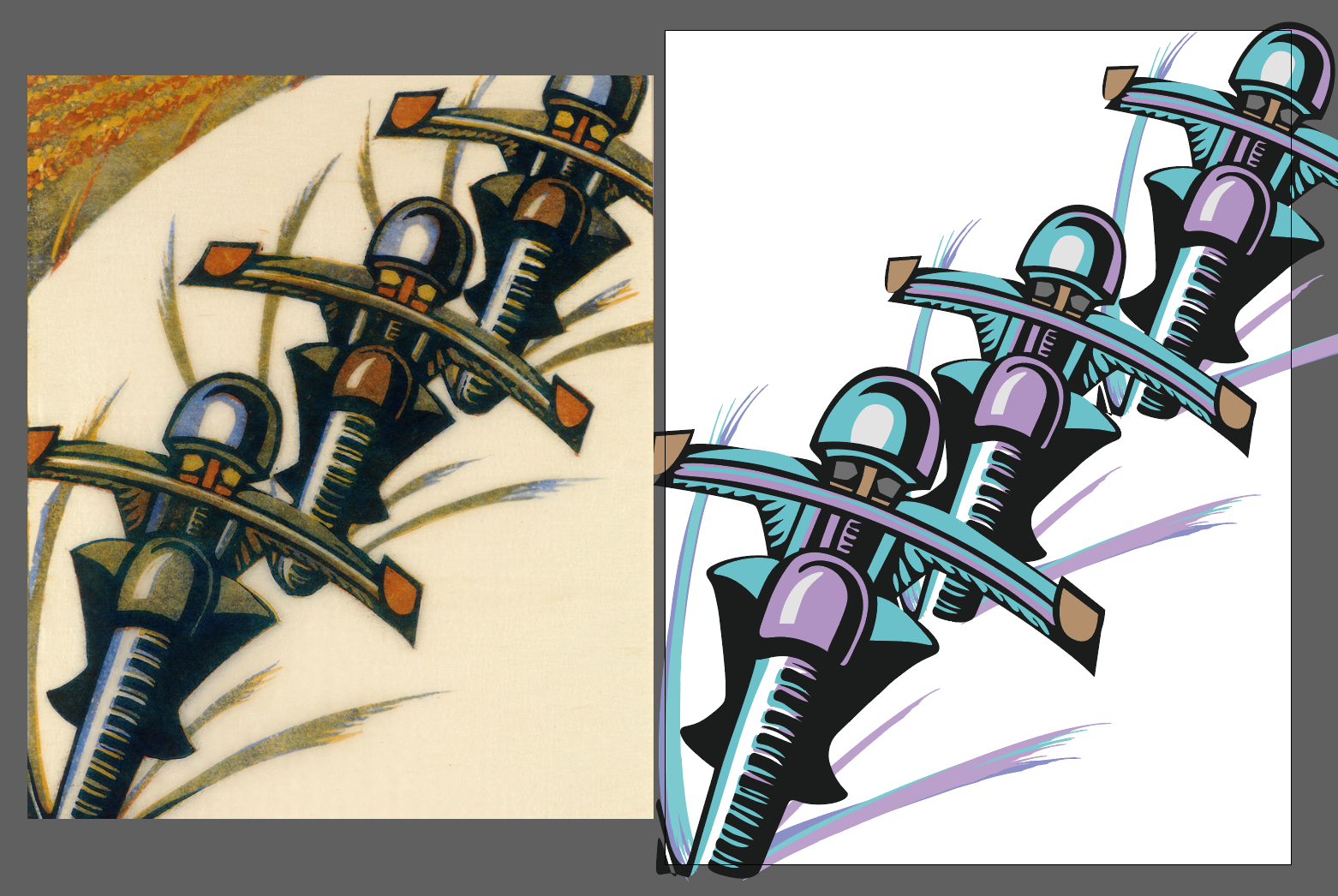
When the Illustrator work is finished, I moved into Photoshop to add a frame and a light, noise texture.
Racing 'Round The Bend
7 - 18 April, 2020
13hrs 10
Haulers
After the effort of Racing 'Round The Bend, I chose a simpler piece to recreate. Haulers depicts four men, heaving a heavy load which isn't shown but can certainly be felt.
With their curved backs and legs drawn in an arc shape, you can see the strain as they pull their load.
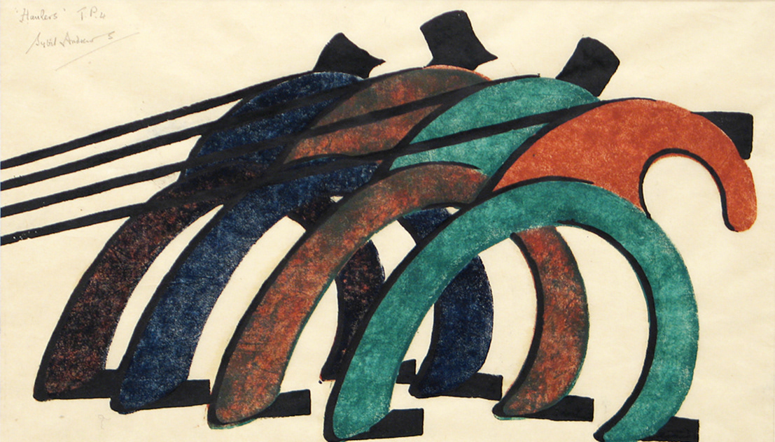

Image descriptions
On the left: Haulers by Sybil Andrews, four men bent over as if pulling a heavy load. The men are abstract shapes e.g. their legs are drawn as an arc shape. Sybil uses a limited colour palette, teal and tan, with black for hats and ropes. The colours darken to navy blue and dark brown as the figures retreat into the distance. The linocut prints also have wonderful texture.
On the right: my first progress image, with rough gold and blue colours to differentiate the four figures.
My colour choices of a dirty gold to navy blue are just to differentiate the four figures. I ponder how Sybil drew the shapes so smoothly without the help of anchor points and the Undo option.
Taking The Strain
Image description
My four men bent over as if pulling a heavy load. Ropes are indicated with thick, black lines. The men's legs are drawn as a single arc shape and they are each wearing a black hat. There are no other features; the men are simply shapes. They retreat into the distance in increments, right to left, with the man on the right at the forefront.
I chose colours of teal, maroon, gold-green, purple and dark green for the legs and bodies. The colour alternate between the legs and the bodies, and get darker on the figures towards the rear.
For the texture I transferred the image to Photoshop and added a little noise.
19 - 20 April, 2020
2hrs 45
The Commute
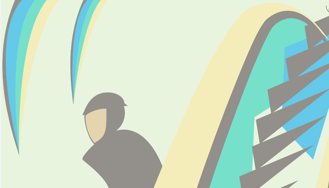
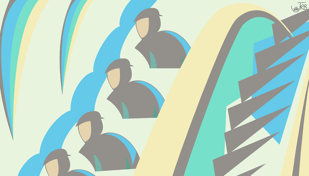
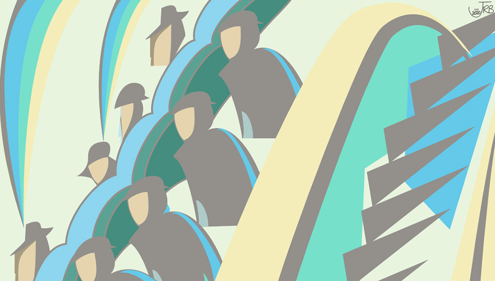
I don't know what Sybil called this piece, so I've named it "The Commute". It's wonderful perspective of an escalator in close up, with one side full of hat and cap-wearing commuters on the way to work.
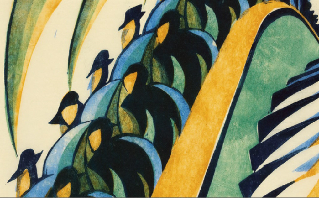

Image descriptions
On the left: The Commute by Sybil Andrews, shows an escalator in close-up. The left side is full of people coming down, wearing hats or caps, the right side is empty. The figures are midnight blue, with blue highlights and no facial details. The escalator has a yellow handrail area, and green sides, with midnight blue steps.
On the right: my first progress image, showing the handrail and empty steps to the right, and one figure on the left.
I like the colours of Sybil's original work, so I chose the same colours but in pastel shades. Again, being able to copy and paste many of the shapes made this a relatively easy piece to recreate.
Escalating
A quick trip into Photoshop to add an overlay of noise with a Blend Mode of Colour Burn helps the colours to pop.
21 -22 April, 2020
4hrs 25
Gale
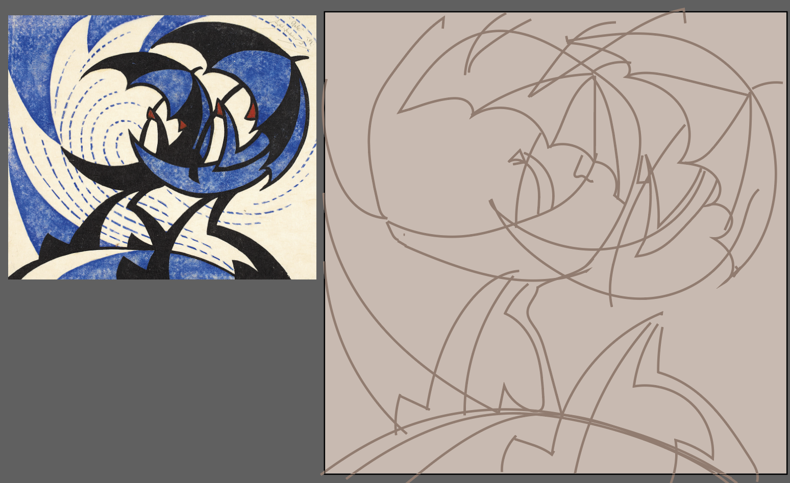
Gale by Sybil Andrews, two figures taking a walk on a windy day. The people are depicted as a crescent moon shape, with umbrellas using the same shape. Their legs are exaggerated with large feet. The wind is symbolised by swirled, dotted lines, and the figures leaning towards the right as if walking into the strong wind. This piece uses only two colours, blue and black, with an off-white background.
Below are three progress shots, from sketch outline onwards. This is the first time I also tried doing the rough sketch in Illustrator. I can see an improvement, writing this one year later; I have a better understanding of the Pencil, Brush and Pen Tools!
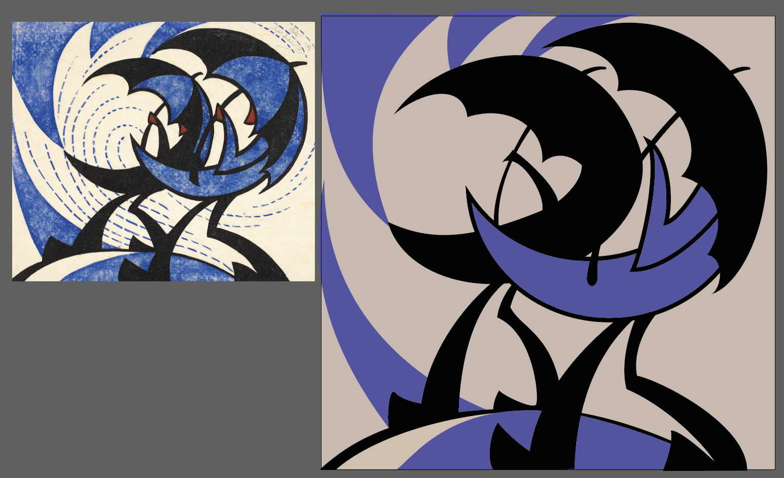

Blow Me Down
In Photoshop I added the same overlay of noise, and also a black frame with a blue mat surround.
23 -29 April, 2020
6hrs 15
Wet Race Day
This work by Sybil reminds me of racecourses, maybe the Grand National or Royal Ascot, when the weather is bloomin' awful! A collection of five men, four adults and a child, huddled under umbrellas and muffled up in coats and hats.
Wet Race Day by Sybil Andrews. Everyone is grouped on the left, looking towards the right. Three or four random, diagonal lines imply the rain blowing at their backs. There are minimal facial features, each different, and the coat colours alternate between blue and green. My pencil sketch is on the right.
I sketched this in Photoshop, and used a grid to manage getting the right proportions. That's why the lines are jagged; I drew from one grid space to another, rather than in long lines.

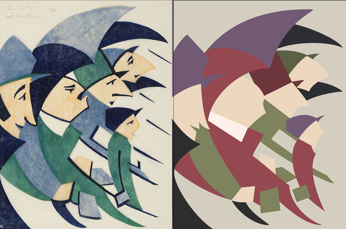

Image descriptions
My progress images,, with Sybil's original on the left. By the second image I'd changed colours to muted purple and green, rather than blue and green.
Rainy Day
No additional editing in Photoshop this time.
And it's only looking back through this project, and Sybil's other work, that I realise she doesn't have many women in her images. I find this interesting because much character art I see currently feature female faces. Indeed, were I to sit down and draw a character I will gravitate towards drawing a female.
30 April - 09 May, 2020
9hrs
33 Days of The 100-Day Project
Drawing every day was not an activity I was used to a year ago. I began struggling with painful hands by the time I started Blow Me Down. The tendency was too grip either my mouse or my pen too tightly in an effort to have more control over my lines and shapes. I decided to stop after Rainy Day.
But 33 days is not too shabby for attempting a daily practice for the first time.
Total project time: 33 days/35hrs 58
